ValidMind for model validation 4 — Finalize testing and reporting
Learn how to use ValidMind for your end-to-end model validation process with our series of four introductory notebooks. In this last notebook, finalize the compliance assessment process and have a complete validation report ready for review.
This notebook will walk you through how to supplement ValidMind tests with your own custom tests and include them as additional evidence in your validation report. A custom test is any function that takes a set of inputs and parameters as arguments and returns one or more outputs:
The function can be as simple or as complex as you need it to be — it can use external libraries, make API calls, or do anything else that you can do in Python.
The only requirement is that the function signature and return values can be "understood" and handled by the ValidMind Library. As such, custom tests offer added flexibility by extending the default tests provided by ValidMind, enabling you to document any type of model or use case.
For a more in-depth introduction to custom tests, refer to our Implement custom tests notebook.
Learn by doing
Our course tailor-made for validators new to ValidMind combines this series of notebooks with more a more in-depth introduction to the ValidMind Platform — Validator Fundamentals
Prerequisites
In order to finalize validation and reporting, you'll need to first have:
Need help with the above steps?
Refer to the first three notebooks in this series:
# Make sure the ValidMind Library is installed%pip install -q validmind# Load your model identifier credentials from an `.env` file%load_ext dotenv%dotenv .env# Or replace with your code snippetimport validmind as vmvm.init(# api_host="...",# api_key="...",# api_secret="...",# model="...", document="validation-report",)
Note: you may need to restart the kernel to use updated packages.
2026-04-07 23:11:44,478 - INFO(validmind.api_client): 🎉 Connected to ValidMind!
📊 Model: [ValidMind Academy] Model validation (ID: cmalguc9y02ok199q2db381ib)
📁 Document Type: validation_report
Import the sample dataset
Next, we'll load in the same sample Bank Customer Churn Prediction dataset used to develop the champion model that we will independently preprocess:
# Load the sample datasetfrom validmind.datasets.classification import customer_churn as demo_datasetprint(f"Loaded demo dataset with: \n\n\t• Target column: '{demo_dataset.target_column}' \n\t• Class labels: {demo_dataset.class_labels}")raw_df = demo_dataset.load_data()
Loaded demo dataset with:

    • Target column: 'Exited'
    • Class labels: {'0': 'Did not exit', '1': 'Exited'}
# Initialize the raw dataset for use in ValidMind testsvm_raw_dataset = vm.init_dataset( dataset=raw_df, input_id="raw_dataset", target_column="Exited",)
import pandas as pdraw_copy_df = raw_df.sample(frac=1) # Create a copy of the raw dataset# Create a balanced dataset with the same number of exited and not exited customersexited_df = raw_copy_df.loc[raw_copy_df["Exited"] ==1]not_exited_df = raw_copy_df.loc[raw_copy_df["Exited"] ==0].sample(n=exited_df.shape[0])balanced_raw_df = pd.concat([exited_df, not_exited_df])balanced_raw_df = balanced_raw_df.sample(frac=1, random_state=42)
Let’s also quickly remove highly correlated features from the dataset using the output from a ValidMind test:
# Register new data and now 'balanced_raw_dataset' is the new dataset object of interestvm_balanced_raw_dataset = vm.init_dataset( dataset=balanced_raw_df, input_id="balanced_raw_dataset", target_column="Exited",)
# Run HighPearsonCorrelation test with our balanced dataset as input and return a result objectcorr_result = vm.tests.run_test( test_id="validmind.data_validation.HighPearsonCorrelation", params={"max_threshold": 0.3}, inputs={"dataset": vm_balanced_raw_dataset},)
❌ High Pearson Correlation
The High Pearson Correlation test identifies pairs of features in the dataset that exhibit strong linear relationships, with the aim of detecting potential feature redundancy or multicollinearity. The results table lists the top ten feature pairs ranked by the absolute value of their Pearson correlation coefficients, along with their corresponding coefficients and Pass/Fail status based on a threshold of 0.3. Only one feature pair exceeds the threshold, while the remaining pairs show lower correlation values and pass the test criteria.
Key insights:
One feature pair exceeds correlation threshold: The pair (Age, Exited) has a Pearson correlation coefficient of 0.3522, surpassing the 0.3 threshold and resulting in a Fail status.
All other feature pairs show low correlations: The remaining nine feature pairs have coefficients ranging from -0.1785 to 0.0526, all below the threshold and marked as Pass.
No evidence of widespread multicollinearity: Only a single pair demonstrates a correlation above the threshold, with no clusters of high correlation among other features.
The test results indicate that the dataset contains minimal linear redundancy among most feature pairs, with only the (Age, Exited) pair exhibiting a moderate correlation above the specified threshold. The overall correlation structure suggests low risk of multicollinearity affecting model interpretability or performance, as the majority of feature relationships remain below the defined threshold.
Parameters:
{
  "max_threshold": 0.3
}
Tables
Columns
Coefficient
Pass/Fail
(Age, Exited)
0.3522
Fail
(Balance, NumOfProducts)
-0.1785
Pass
(IsActiveMember, Exited)
-0.1764
Pass
(Balance, Exited)
0.1390
Pass
(CreditScore, IsActiveMember)
0.0526
Pass
(NumOfProducts, Exited)
-0.0481
Pass
(CreditScore, Exited)
-0.0384
Pass
(Tenure, EstimatedSalary)
0.0378
Pass
(HasCrCard, IsActiveMember)
-0.0360
Pass
(Age, HasCrCard)
-0.0326
Pass
# From result object, extract table from `corr_result.tables`features_df = corr_result.tables[0].datafeatures_df
Columns
Coefficient
Pass/Fail
0
(Age, Exited)
0.3522
Fail
1
(Balance, NumOfProducts)
-0.1785
Pass
2
(IsActiveMember, Exited)
-0.1764
Pass
3
(Balance, Exited)
0.1390
Pass
4
(CreditScore, IsActiveMember)
0.0526
Pass
5
(NumOfProducts, Exited)
-0.0481
Pass
6
(CreditScore, Exited)
-0.0384
Pass
7
(Tenure, EstimatedSalary)
0.0378
Pass
8
(HasCrCard, IsActiveMember)
-0.0360
Pass
9
(Age, HasCrCard)
-0.0326
Pass
# Extract list of features that failed the testhigh_correlation_features = features_df[features_df["Pass/Fail"] =="Fail"]["Columns"].tolist()high_correlation_features
['(Age, Exited)']
# Extract feature names from the list of stringshigh_correlation_features = [feature.split(",")[0].strip("()") for feature in high_correlation_features]high_correlation_features
['Age']
# Remove the highly correlated features from the datasetbalanced_raw_no_age_df = balanced_raw_df.drop(columns=high_correlation_features)# Re-initialize the dataset objectvm_raw_dataset_preprocessed = vm.init_dataset( dataset=balanced_raw_no_age_df, input_id="raw_dataset_preprocessed", target_column="Exited",)
# Re-run the test with the reduced feature setcorr_result = vm.tests.run_test( test_id="validmind.data_validation.HighPearsonCorrelation", params={"max_threshold": 0.3}, inputs={"dataset": vm_raw_dataset_preprocessed},)
✅ High Pearson Correlation
The High Pearson Correlation test evaluates the linear relationships between feature pairs to identify potential redundancy or multicollinearity within the dataset. The results table presents the top ten absolute Pearson correlation coefficients, along with the corresponding feature pairs and Pass/Fail status based on a threshold of 0.3. All reported coefficients are below the threshold, and each feature pair is marked as Pass.
Key insights:
No feature pairs exceed correlation threshold: All absolute Pearson correlation coefficients are below the 0.3 threshold, with the highest magnitude observed at 0.1785 between Balance and NumOfProducts.
Weak linear relationships among top pairs: The strongest correlations, both positive and negative, remain modest in magnitude, indicating limited linear association between the evaluated features.
Consistent Pass status across all pairs: Every feature pair in the top ten list is marked as Pass, reflecting the absence of high linear correlation within the dataset.
The results indicate that the evaluated features do not exhibit strong linear relationships, and no evidence of feature redundancy or multicollinearity is present among the top correlated pairs. The correlation structure supports the interpretability and stability of the model by maintaining independence among predictor variables.
Parameters:
{
  "max_threshold": 0.3
}
Tables
Columns
Coefficient
Pass/Fail
(Balance, NumOfProducts)
-0.1785
Pass
(IsActiveMember, Exited)
-0.1764
Pass
(Balance, Exited)
0.1390
Pass
(CreditScore, IsActiveMember)
0.0526
Pass
(NumOfProducts, Exited)
-0.0481
Pass
(CreditScore, Exited)
-0.0384
Pass
(Tenure, EstimatedSalary)
0.0378
Pass
(HasCrCard, IsActiveMember)
-0.0360
Pass
(NumOfProducts, IsActiveMember)
0.0321
Pass
(Tenure, IsActiveMember)
-0.0303
Pass
Split the preprocessed dataset
With our raw dataset rebalanced with highly correlated features removed, let's now spilt our dataset into train and test in preparation for model evaluation testing:
# Encode categorical features in the datasetbalanced_raw_no_age_df = pd.get_dummies( balanced_raw_no_age_df, columns=["Geography", "Gender"], drop_first=True)balanced_raw_no_age_df.head()
CreditScore
Tenure
Balance
NumOfProducts
HasCrCard
IsActiveMember
EstimatedSalary
Exited
Geography_Germany
Geography_Spain
Gender_Male
4314
682
7
0.00
2
1
0
65069.03
0
False
False
False
7619
648
7
138503.51
2
1
0
57215.85
0
True
False
False
3291
704
3
0.00
2
1
0
73018.74
0
False
True
True
7662
621
7
131033.76
1
0
1
75685.59
1
True
False
False
1661
722
10
138311.76
1
1
1
3472.63
1
True
False
False
from sklearn.model_selection import train_test_split# Split the dataset into train and testtrain_df, test_df = train_test_split(balanced_raw_no_age_df, test_size=0.20)X_train = train_df.drop("Exited", axis=1)y_train = train_df["Exited"]X_test = test_df.drop("Exited", axis=1)y_test = test_df["Exited"]
With our raw dataset assessed and preprocessed, let's go ahead and import the champion model submitted by the model development team in the format of a .pkl file: lr_model_champion.pkl
# Import the champion modelimport pickle as pklwithopen("lr_model_champion.pkl", "rb") as f: log_reg = pkl.load(f)
/opt/hostedtoolcache/Python/3.11.15/x64/lib/python3.11/site-packages/sklearn/base.py:463: InconsistentVersionWarning: Trying to unpickle estimator LogisticRegression from version 1.3.2 when using version 1.8.0. This might lead to breaking code or invalid results. Use at your own risk. For more info please refer to:
https://scikit-learn.org/stable/model_persistence.html#security-maintainability-limitations
  warnings.warn(
Train potential challenger model
We'll also train our random forest classification challenger model to see how it compares:
# Import the Random Forest Classification modelfrom sklearn.ensemble import RandomForestClassifier# Create the model instance with 50 decision treesrf_model = RandomForestClassifier( n_estimators=50, random_state=42,)# Train the modelrf_model.fit(X_train, y_train)
In a Jupyter environment, please rerun this cell to show the HTML representation or trust the notebook. On GitHub, the HTML representation is unable to render, please try loading this page with nbviewer.org.
In addition to the initialized datasets, you'll also need to initialize a ValidMind model object (vm_model) that can be passed to other functions for analysis and tests on the data for each of our two models:
# Initialize the champion logistic regression modelvm_log_model = vm.init_model( log_reg, input_id="log_model_champion",)# Initialize the challenger random forest classification modelvm_rf_model = vm.init_model( rf_model, input_id="rf_model",)
# Assign predictions to Champion — Logistic regression modelvm_train_ds.assign_predictions(model=vm_log_model)vm_test_ds.assign_predictions(model=vm_log_model)# Assign predictions to Challenger — Random forest classification modelvm_train_ds.assign_predictions(model=vm_rf_model)vm_test_ds.assign_predictions(model=vm_rf_model)
2026-04-07 23:11:54,348 - INFO(validmind.vm_models.dataset.utils): Running predict_proba()... This may take a while
2026-04-07 23:11:54,350 - INFO(validmind.vm_models.dataset.utils): Done running predict_proba()
2026-04-07 23:11:54,351 - INFO(validmind.vm_models.dataset.utils): Running predict()... This may take a while
2026-04-07 23:11:54,352 - INFO(validmind.vm_models.dataset.utils): Done running predict()
2026-04-07 23:11:54,354 - INFO(validmind.vm_models.dataset.utils): Running predict_proba()... This may take a while
2026-04-07 23:11:54,355 - INFO(validmind.vm_models.dataset.utils): Done running predict_proba()
2026-04-07 23:11:54,356 - INFO(validmind.vm_models.dataset.utils): Running predict()... This may take a while
2026-04-07 23:11:54,357 - INFO(validmind.vm_models.dataset.utils): Done running predict()
2026-04-07 23:11:54,359 - INFO(validmind.vm_models.dataset.utils): Running predict_proba()... This may take a while
2026-04-07 23:11:54,381 - INFO(validmind.vm_models.dataset.utils): Done running predict_proba()
2026-04-07 23:11:54,381 - INFO(validmind.vm_models.dataset.utils): Running predict()... This may take a while
2026-04-07 23:11:54,403 - INFO(validmind.vm_models.dataset.utils): Done running predict()
2026-04-07 23:11:54,405 - INFO(validmind.vm_models.dataset.utils): Running predict_proba()... This may take a while
2026-04-07 23:11:54,415 - INFO(validmind.vm_models.dataset.utils): Done running predict_proba()
2026-04-07 23:11:54,416 - INFO(validmind.vm_models.dataset.utils): Running predict()... This may take a while
2026-04-07 23:11:54,426 - INFO(validmind.vm_models.dataset.utils): Done running predict()
Implementing custom tests
Thanks to the model documentation (Learn more ...), we know that the model development team implemented a custom test to further evaluate the performance of the champion model.
In a usual model validation situation, you would load a saved custom test provided by the model development team. In the following section, we'll have you implement the same custom test and make it available for reuse, to familiarize you with the processes.
Let's implement the same custom inline test that calculates the confusion matrix for a binary classification model that the model development team used in their performance evaluations.
An inline test refers to a test written and executed within the same environment as the code being tested — in this case, right in this Jupyter Notebook — without requiring a separate test file or framework.
You'll note that the custom test function is just a regular Python function that can include and require any Python library as you see fit.
Create a confusion matrix plot
Let's first create a confusion matrix plot using the confusion_matrix function from the sklearn.metrics module:
import matplotlib.pyplot as pltfrom sklearn import metrics# Get the predicted classesy_pred = log_reg.predict(vm_test_ds.x)confusion_matrix = metrics.confusion_matrix(y_test, y_pred)cm_display = metrics.ConfusionMatrixDisplay( confusion_matrix=confusion_matrix, display_labels=[False, True])cm_display.plot()
Next, create a @vm.test wrapper that will allow you to create a reusable test. Note the following changes in the code below:
The function confusion_matrix takes two arguments dataset and model. This is a VMDataset and VMModel object respectively.
VMDataset objects allow you to access the dataset's true (target) values by accessing the .y attribute.
VMDataset objects allow you to access the predictions for a given model by accessing the .y_pred() method.
The function docstring provides a description of what the test does. This will be displayed along with the result in this notebook as well as in the ValidMind Platform.
The function body calculates the confusion matrix using the sklearn.metrics.confusion_matrix function as we just did above.
The function then returns the ConfusionMatrixDisplay.figure_ object — this is important as the ValidMind Library expects the output of the custom test to be a plot or a table.
The @vm.test decorator is doing the work of creating a wrapper around the function that will allow it to be run by the ValidMind Library. It also registers the test so it can be found by the ID my_custom_tests.ConfusionMatrix.
@vm.test("my_custom_tests.ConfusionMatrix")def confusion_matrix(dataset, model):"""The confusion matrix is a table that is often used to describe the performance of a classification model on a set of data for which the true values are known. The confusion matrix is a 2x2 table that contains 4 values: - True Positive (TP): the number of correct positive predictions - True Negative (TN): the number of correct negative predictions - False Positive (FP): the number of incorrect positive predictions - False Negative (FN): the number of incorrect negative predictions The confusion matrix can be used to assess the holistic performance of a classification model by showing the accuracy, precision, recall, and F1 score of the model on a single figure. """ y_true = dataset.y y_pred = dataset.y_pred(model=model) confusion_matrix = metrics.confusion_matrix(y_true, y_pred) cm_display = metrics.ConfusionMatrixDisplay( confusion_matrix=confusion_matrix, display_labels=[False, True] ) cm_display.plot() plt.close() # close the plot to avoid displaying itreturn cm_display.figure_ # return the figure object itself
You can now run the newly created custom test on both the training and test datasets for both models using the run_test() function:
The Confusion Matrix test evaluates the classification performance of the model by comparing predicted and true labels for both the training and test datasets. The resulting matrices display the counts of true positives, true negatives, false positives, and false negatives, providing a comprehensive view of model accuracy and error distribution. The training dataset matrix shows the model's fit to the data it was trained on, while the test dataset matrix reflects generalization to unseen data.
Key insights:
Balanced classification performance on training data: The training confusion matrix shows 821 true negatives, 819 true positives, 450 false positives, and 495 false negatives, indicating similar rates of correct classification for both classes.
Consistent error distribution on test data: The test confusion matrix records 209 true negatives, 190 true positives, 136 false positives, and 112 false negatives, with error rates remaining proportionally similar to those observed in training.
Comparable false positive and false negative rates: Both datasets exhibit a relatively even distribution between false positives and false negatives, suggesting no pronounced bias toward over- or under-predicting either class.
The confusion matrix results indicate that the model maintains consistent classification behavior across both training and test datasets, with balanced accuracy and error rates for both classes. The observed distribution of true and false predictions suggests stable model generalization and no evidence of class imbalance or overfitting based on confusion matrix structure.
Figures
2026-04-07 23:12:00,267 - INFO(validmind.vm_models.result.result): Test driven block with result_id my_custom_tests.ConfusionMatrix:champion does not exist in model's document
The Confusion Matrix test evaluates the classification performance of the model by comparing predicted and actual class labels for both the training and test datasets. The resulting matrices display the counts of true positives, true negatives, false positives, and false negatives, providing a comprehensive view of model accuracy and error types. The first matrix corresponds to the training dataset, while the second matrix summarizes results for the test dataset, enabling assessment of both in-sample and out-of-sample predictive behavior.
Key insights:
Near-perfect classification on training data: The training confusion matrix shows 1271 true negatives, 1313 true positives, 0 false positives, and 1 false negative, indicating almost flawless separation of classes on the training set.
Increased misclassification on test data: The test confusion matrix records 237 true negatives, 203 true positives, 108 false positives, and 99 false negatives, reflecting a notable rise in both types of misclassification compared to training.
Balanced error distribution in test set: False positives (108) and false negatives (99) are of similar magnitude in the test set, suggesting that misclassification is not heavily skewed toward one class.
The confusion matrix results indicate that the model achieves extremely high accuracy on the training data, with minimal misclassification. However, performance on the test data shows a substantial increase in both false positives and false negatives, pointing to a reduction in generalization capability. The distribution of errors in the test set is relatively balanced between the two classes, highlighting the need to consider both types of misclassification when evaluating model effectiveness on unseen data.
Figures
2026-04-07 23:12:06,386 - INFO(validmind.vm_models.result.result): Test driven block with result_id my_custom_tests.ConfusionMatrix:challenger does not exist in model's document
Note the output returned indicating that a test-driven block doesn't currently exist in your model's documentation for some test IDs.
That's expected, as when we run validations tests the results logged need to be manually added to your report as part of your compliance assessment process within the ValidMind Platform.
Add parameters to custom tests
Custom tests can take parameters just like any other function. To demonstrate, let's modify the confusion_matrix function to take an additional parameter normalize that will allow you to normalize the confusion matrix:
@vm.test("my_custom_tests.ConfusionMatrix")def confusion_matrix(dataset, model, normalize=False):"""The confusion matrix is a table that is often used to describe the performance of a classification model on a set of data for which the true values are known. The confusion matrix is a 2x2 table that contains 4 values: - True Positive (TP): the number of correct positive predictions - True Negative (TN): the number of correct negative predictions - False Positive (FP): the number of incorrect positive predictions - False Negative (FN): the number of incorrect negative predictions The confusion matrix can be used to assess the holistic performance of a classification model by showing the accuracy, precision, recall, and F1 score of the model on a single figure. """ y_true = dataset.y y_pred = dataset.y_pred(model=model)if normalize: confusion_matrix = metrics.confusion_matrix(y_true, y_pred, normalize="all")else: confusion_matrix = metrics.confusion_matrix(y_true, y_pred) cm_display = metrics.ConfusionMatrixDisplay( confusion_matrix=confusion_matrix, display_labels=[False, True] ) cm_display.plot() plt.close() # close the plot to avoid displaying itreturn cm_display.figure_ # return the figure object itself
Pass parameters to custom tests
You can pass parameters to custom tests by providing a dictionary of parameters to the run_test() function.
The parameters will override any default parameters set in the custom test definition. Note that dataset and model are still passed as inputs.
Since these are VMDataset or VMModel inputs, they have a special meaning.
Re-running and logging the custom confusion matrix with normalize=True for both models and our testing dataset looks like this:
# Champion with test dataset and normalize=Truevm.tests.run_test( test_id="my_custom_tests.ConfusionMatrix:test_normalized_champion", input_grid={"dataset": [vm_test_ds],"model" : [vm_log_model] }, params={"normalize": True}).log()
Confusion Matrix Test Normalized Champion
The ConfusionMatrix:test_normalized_champion test evaluates the classification performance of the model by presenting the normalized confusion matrix for the test dataset. The matrix displays the proportion of true positives, true negatives, false positives, and false negatives, allowing for assessment of the model's predictive accuracy and error distribution. Each cell in the matrix represents the fraction of total predictions falling into each category, providing a holistic view of model performance across both classes.
Key insights:
Balanced distribution of correct predictions: The model correctly predicts the negative class (True Negative) in 32% of cases and the positive class (True Positive) in 29% of cases, indicating similar accuracy across both classes.
Notable proportion of false positives and false negatives: False positives account for 21% and false negatives for 17% of predictions, reflecting a moderate level of misclassification in both directions.
No class dominates prediction errors: The distribution of errors is relatively even, with neither false positives nor false negatives overwhelmingly exceeding the other.
The normalized confusion matrix indicates that the model achieves comparable accuracy for both positive and negative classes, with error rates distributed across false positives and false negatives. The results suggest a balanced classification profile, with no single error type disproportionately affecting overall performance.
Parameters:
{
  "normalize": true
}
Figures
2026-04-07 23:12:11,226 - INFO(validmind.vm_models.result.result): Test driven block with result_id my_custom_tests.ConfusionMatrix:test_normalized_champion does not exist in model's document
# Challenger with test dataset and normalize=Truevm.tests.run_test( test_id="my_custom_tests.ConfusionMatrix:test_normalized_challenger", input_grid={"dataset": [vm_test_ds],"model" : [vm_rf_model] }, params={"normalize": True}).log()
Confusion Matrix Test Normalized Challenger
The ConfusionMatrix:test_normalized_challenger test evaluates the classification performance of the model by displaying the normalized confusion matrix for the test dataset. The matrix presents the proportion of true positives, true negatives, false positives, and false negatives, normalized such that the sum of all entries equals 1. The results are visualized as a heatmap, with each cell representing the fraction of predictions for each true/predicted label combination.
Key insights:
True negatives are the most frequent outcome: The model correctly predicts the negative class in 37% of all cases, representing the highest proportion among all matrix entries.
True positives are the second most common: Correct positive predictions account for 31% of all cases, indicating substantial model sensitivity to the positive class.
False positives and false negatives are comparable: The model produces false positives in 17% and false negatives in 15% of cases, reflecting a relatively balanced distribution of misclassification types.
The confusion matrix indicates that the model achieves its highest accuracy in identifying true negatives, with true positives also representing a significant share of correct predictions. The rates of false positives and false negatives are similar, suggesting balanced misclassification behavior across both classes. Overall, the model demonstrates moderate discriminatory power, with correct predictions (true positives and true negatives) comprising the majority of outcomes.
Parameters:
{
  "normalize": true
}
Figures
2026-04-07 23:12:16,753 - INFO(validmind.vm_models.result.result): Test driven block with result_id my_custom_tests.ConfusionMatrix:test_normalized_challenger does not exist in model's document
Use external test providers
Sometimes you may want to reuse the same set of custom tests across multiple models and share them with others in your organization, like the model development team would have done with you in this example workflow featured in this series of notebooks. In this case, you can create an external custom test provider that will allow you to load custom tests from a local folder or a Git repository.
In this section you will learn how to declare a local filesystem test provider that allows loading tests from a local folder following these high level steps:
Create a folder of custom tests from existing inline tests (tests that exist in your active Jupyter Notebook)
Let's start by creating a new folder that will contain reusable custom tests from your existing inline tests.
The following code snippet will create a new my_tests directory in the current working directory if it doesn't exist:
tests_folder ="my_tests"import os# create tests folderos.makedirs(tests_folder, exist_ok=True)# remove existing testsfor f in os.listdir(tests_folder):# remove files and pycacheif f.endswith(".py") or f =="__pycache__": os.system(f"rm -rf {tests_folder}/{f}")
After running the command above, confirm that a new my_tests directory was created successfully. For example:
~/notebooks/tutorials/model_validation/my_tests/
Save an inline test
The @vm.test decorator we used in Implement a custom inline test above to register one-off custom tests also includes a convenience method on the function object that allows you to simply call <func_name>.save() to save the test to a Python file at a specified path.
While save() will get you started by creating the file and saving the function code with the correct name, it won't automatically include any imports, or other functions or variables, outside of the functions that are needed for the test to run. To solve this, pass in an optional imports argument ensuring necessary imports are added to the file.
The confusion_matrix test requires the following additional imports:
import matplotlib.pyplot as pltfrom sklearn import metrics
Let's pass these imports to the save() method to ensure they are included in the file with the following command:
confusion_matrix.save(# Save it to the custom tests folder we created tests_folder, imports=["import matplotlib.pyplot as plt", "from sklearn import metrics"],)
2026-04-07 23:12:17,166 - INFO(validmind.tests.decorator): Saved to /home/runner/work/documentation/documentation/site/notebooks/EXECUTED/model_validation/my_tests/ConfusionMatrix.py!Be sure to add any necessary imports to the top of the file.
2026-04-07 23:12:17,166 - INFO(validmind.tests.decorator): This metric can be run with the ID: <test_provider_namespace>.ConfusionMatrix
# Saved from __main__.confusion_matrix
# Original Test ID: my_custom_tests.ConfusionMatrix
# New Test ID: <test_provider_namespace>.ConfusionMatrix
Now that your my_tests folder has a sample custom test, let's initialize a test provider that will tell the ValidMind Library where to find your custom tests:
ValidMind offers out-of-the-box test providers for local tests (tests in a folder) or a Github provider for tests in a Github repository.
You can also create your own test provider by creating a class that has a load_test method that takes a test ID and returns the test function matching that ID.
For most use cases, using a LocalTestProvider that allows you to load custom tests from a designated directory should be sufficient.
The most important attribute for a test provider is its namespace. This is a string that will be used to prefix test IDs in model documentation. This allows you to have multiple test providers with tests that can even share the same ID, but are distinguished by their namespace.
Let's go ahead and load the custom tests from our my_tests directory:
from validmind.tests import LocalTestProvider# initialize the test provider with the tests folder we created earliermy_test_provider = LocalTestProvider(tests_folder)vm.tests.register_test_provider( namespace="my_test_provider", test_provider=my_test_provider,)# `my_test_provider.load_test()` will be called for any test ID that starts with `my_test_provider`# e.g. `my_test_provider.ConfusionMatrix` will look for a function named `ConfusionMatrix` in `my_tests/ConfusionMatrix.py` file
Run test provider tests
Now that we've set up the test provider, we can run any test that's located in the tests folder by using the run_test() method as with any other test:
For tests that reside in a test provider directory, the test ID will be the namespace specified when registering the provider, followed by the path to the test file relative to the tests folder.
For example, the Confusion Matrix test we created earlier will have the test ID my_test_provider.ConfusionMatrix. You could organize the tests in subfolders, say classification and regression, and the test ID for the Confusion Matrix test would then be my_test_provider.classification.ConfusionMatrix.
Let's go ahead and re-run the confusion matrix test with our testing dataset for our two models by using the test ID my_test_provider.ConfusionMatrix. This should load the test from the test provider and run it as before.
# Champion with test dataset and test provider custom testvm.tests.run_test( test_id="my_test_provider.ConfusionMatrix:champion", input_grid={"dataset": [vm_test_ds],"model" : [vm_log_model] }).log()
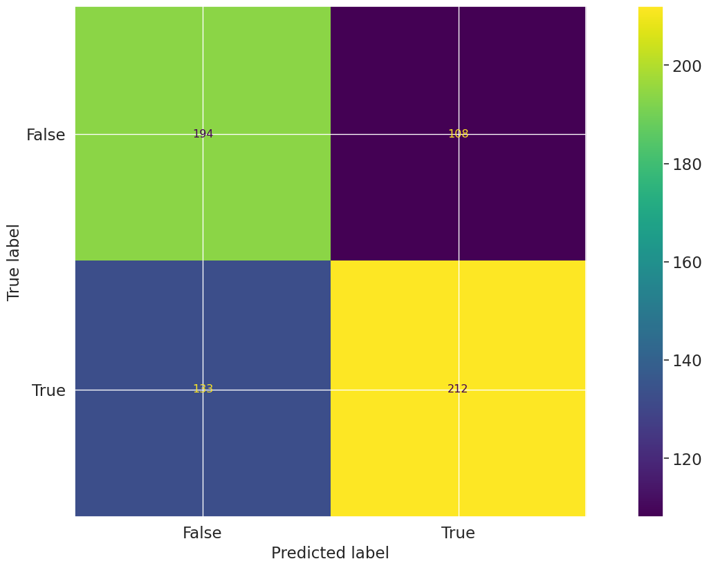
Confusion Matrix Champion
The Confusion Matrix test evaluates the classification performance of the model by comparing predicted labels to true labels on the test dataset. The resulting matrix displays the counts of true positives, true negatives, false positives, and false negatives, providing a comprehensive view of model prediction accuracy and error types. The matrix for the champion model on the test dataset shows the distribution of correct and incorrect predictions across both classes.
Key insights:
Higher true negative and true positive counts: The model correctly identified 209 true negatives and 190 true positives, indicating balanced detection capability across both classes.
Noticeable false positive and false negative rates: There are 136 false positives and 112 false negatives, reflecting a moderate level of misclassification in both directions.
Comparable error distribution: The counts of false positives and false negatives are of similar magnitude, suggesting that the model does not exhibit a strong bias toward over- or under-predicting either class.
The confusion matrix reveals that the model demonstrates balanced performance in identifying both positive and negative cases, with true positive and true negative counts exceeding the respective false classifications. The presence of moderate false positive and false negative rates indicates areas for potential improvement but does not suggest a pronounced skew in prediction errors. Overall, the model maintains a consistent classification profile across both outcome classes.
Figures
2026-04-07 23:12:23,134 - INFO(validmind.vm_models.result.result): Test driven block with result_id my_test_provider.ConfusionMatrix:champion does not exist in model's document
# Challenger with test dataset and test provider custom testvm.tests.run_test( test_id="my_test_provider.ConfusionMatrix:challenger", input_grid={"dataset": [vm_test_ds],"model" : [vm_rf_model] }).log()
Confusion Matrix Challenger
The Confusion Matrix:challenger test evaluates the classification performance of the model by comparing predicted labels against true labels on the test dataset. The resulting confusion matrix presents the counts of true positives, true negatives, false positives, and false negatives, providing a comprehensive view of the model's prediction accuracy and error distribution. The matrix enables assessment of both correct and incorrect classifications for each class, supporting further calculation of derived metrics such as precision, recall, and F1 score.
Key insights:
Balanced correct classification across classes: The model correctly classified 237 negative cases (true negatives) and 203 positive cases (true positives), indicating substantial correct identification in both classes.
Comparable false positive and false negative rates: There are 108 false positives and 99 false negatives, reflecting a relatively balanced distribution of misclassification errors between the two classes.
No evidence of class dominance: The confusion matrix does not indicate a strong bias toward predicting either class, as both types of errors and correct predictions are of similar magnitude.
The confusion matrix reveals that the model demonstrates balanced performance in distinguishing between positive and negative cases, with similar rates of correct and incorrect predictions for each class. The distribution of errors suggests that the model does not exhibit a pronounced bias toward either class, supporting its suitability for applications where balanced classification is important.
Figures
2026-04-07 23:12:28,376 - INFO(validmind.vm_models.result.result): Test driven block with result_id my_test_provider.ConfusionMatrix:challenger does not exist in model's document
Verify test runs
Our final task is to verify that all the tests provided by the model development team were run and reported accurately. Note the appended result_ids to delineate which dataset we ran the test with for the relevant tests.
Here, we'll specify all the tests we'd like to independently rerun in a dictionary called test_config. Note here that inputs and input_grid expect the input_id of the dataset or model as the value rather than the variable name we specified:
for t in test_config:print(t)try:# Check if test has input_gridif'input_grid'in test_config[t]:# For tests with input_grid, pass the input_grid configurationif'params'in test_config[t]: vm.tests.run_test(t, input_grid=test_config[t]['input_grid'], params=test_config[t]['params']).log()else: vm.tests.run_test(t, input_grid=test_config[t]['input_grid']).log()else:# Original logic for regular inputsif'params'in test_config[t]: vm.tests.run_test(t, inputs=test_config[t]['inputs'], params=test_config[t]['params']).log()else: vm.tests.run_test(t, inputs=test_config[t]['inputs']).log()exceptExceptionas e:print(f"Error running test {t}: {str(e)}")
The DatasetDescription:raw_data test provides a comprehensive statistical summary of each column in the model's dataset, including data type, count, missingness, and the number of distinct values. The results table presents these metrics for all variables, enabling assessment of data completeness and feature characteristics. All columns are accounted for, with explicit reporting of missing values and distinct value counts for both numerical and categorical features.
Key insights:
No missing values across all columns: All 11 columns report 0 missing values, indicating complete data coverage for the entire dataset.
High cardinality in select numeric features: The Balance and EstimatedSalary columns exhibit high distinct value counts (5,088 and 8,000 respectively), with EstimatedSalary showing a distinct value for every record.
Low cardinality in categorical features: Categorical columns such as Geography, Gender, HasCrCard, IsActiveMember, and Exited have between 2 and 3 distinct values, reflecting limited category diversity.
Moderate cardinality in other numeric features: CreditScore and Age have 452 and 69 distinct values respectively, while Tenure and NumOfProducts have 11 and 4, indicating varying levels of granularity among numeric predictors.
The dataset is fully populated with no missing values, supporting robust model training and evaluation. Feature cardinality varies substantially, with some numeric variables exhibiting high uniqueness and categorical variables maintaining low diversity. This distribution of feature types and cardinalities provides a clear foundation for subsequent modeling and risk assessment activities.
Tables
Dataset Description
Name
Type
Count
Missing
Missing %
Distinct
Distinct %
CreditScore
Numeric
8000.0
0
0.0
452
0.0565
Geography
Categorical
8000.0
0
0.0
3
0.0004
Gender
Categorical
8000.0
0
0.0
2
0.0002
Age
Numeric
8000.0
0
0.0
69
0.0086
Tenure
Numeric
8000.0
0
0.0
11
0.0014
Balance
Numeric
8000.0
0
0.0
5088
0.6360
NumOfProducts
Numeric
8000.0
0
0.0
4
0.0005
HasCrCard
Categorical
8000.0
0
0.0
2
0.0002
IsActiveMember
Categorical
8000.0
0
0.0
2
0.0002
EstimatedSalary
Numeric
8000.0
0
0.0
8000
1.0000
Exited
Categorical
8000.0
0
0.0
2
0.0002
2026-04-07 23:12:33,587 - INFO(validmind.vm_models.result.result): Test driven block with result_id validmind.data_validation.DatasetDescription:raw_data does not exist in model's document
The Descriptive Statistics test evaluates the distributional characteristics of both numerical and categorical variables in the dataset. The results present summary statistics for eight numerical variables, including measures of central tendency, dispersion, and range, as well as frequency-based summaries for two categorical variables. The numerical table details counts, means, standard deviations, and percentiles, while the categorical table provides counts, unique value counts, and the dominance of the most frequent category. These results offer a comprehensive overview of the dataset's structure and variable distributions.
Key insights:
Wide range and skewness in balance and salary: The Balance variable has a mean of 76,434 and a median of 97,264, with a minimum of 0 and a maximum of 250,898, indicating a right-skewed distribution. EstimatedSalary also shows a broad range, with a mean of 99,790, a median of 99,505, and a maximum of 199,992.
CreditScore and Age distributions are symmetric: CreditScore and Age have means (650.16 and 38.95, respectively) closely aligned with their medians (652.0 and 37.0), suggesting relatively symmetric distributions.
Binary variables show balanced representation: HasCrCard and IsActiveMember have means of 0.70 and 0.52, respectively, indicating a moderate split between categories.
Categorical dominance in Geography and Gender: France is the most frequent Geography (50.12%), and Male is the most frequent Gender (54.95%), indicating moderate category dominance but not extreme imbalance.
No missing data detected: All variables report a count of 8,000, indicating complete data coverage for all fields.
The dataset exhibits a mix of symmetric and skewed distributions among numerical variables, with Balance and EstimatedSalary showing pronounced right skewness. Categorical variables display moderate dominance of single categories but retain diversity, as evidenced by multiple unique values. The absence of missing data supports data completeness, and the overall distributional characteristics provide a clear foundation for further model analysis and validation.
Tables
Numerical Variables
Name
Count
Mean
Std
Min
25%
50%
75%
90%
95%
Max
CreditScore
8000.0
650.1596
96.8462
350.0
583.0
652.0
717.0
778.0
813.0
850.0
Age
8000.0
38.9489
10.4590
18.0
32.0
37.0
44.0
53.0
60.0
92.0
Tenure
8000.0
5.0339
2.8853
0.0
3.0
5.0
8.0
9.0
9.0
10.0
Balance
8000.0
76434.0965
62612.2513
0.0
0.0
97264.0
128045.0
149545.0
162488.0
250898.0
NumOfProducts
8000.0
1.5325
0.5805
1.0
1.0
1.0
2.0
2.0
2.0
4.0
HasCrCard
8000.0
0.7026
0.4571
0.0
0.0
1.0
1.0
1.0
1.0
1.0
IsActiveMember
8000.0
0.5199
0.4996
0.0
0.0
1.0
1.0
1.0
1.0
1.0
EstimatedSalary
8000.0
99790.1880
57520.5089
12.0
50857.0
99505.0
149216.0
179486.0
189997.0
199992.0
Categorical Variables
Name
Count
Number of Unique Values
Top Value
Top Value Frequency
Top Value Frequency %
Geography
8000.0
3.0
France
4010.0
50.12
Gender
8000.0
2.0
Male
4396.0
54.95
2026-04-07 23:12:41,818 - INFO(validmind.vm_models.result.result): Test driven block with result_id validmind.data_validation.DescriptiveStatistics:raw_data does not exist in model's document
validmind.data_validation.MissingValues:raw_data
✅ Missing Values Raw Data
The Missing Values test evaluates dataset quality by measuring the proportion of missing values in each feature and comparing it to a predefined threshold. The results table presents, for each column, the number and percentage of missing values, along with a Pass/Fail status based on whether the missingness exceeds the 1.0% threshold. All features are listed with their respective missing value statistics and test outcomes, providing a comprehensive view of data completeness across the dataset.
Key insights:
No missing values detected: All features report zero missing values, with both the number and percentage of missing values recorded as 0.0%.
Universal pass across features: Every feature meets the missing value threshold, resulting in a "Pass" status for all columns.
The dataset demonstrates complete data integrity with respect to missing values, as all features contain fully populated records and satisfy the established threshold. This indicates a high level of data quality, minimizing the risk of bias or instability due to incomplete data in subsequent modeling processes.
Parameters:
{
  "min_percentage_threshold": 1
}
Tables
Column
Number of Missing Values
Percentage of Missing Values (%)
Pass/Fail
CreditScore
0
0.0
Pass
Geography
0
0.0
Pass
Gender
0
0.0
Pass
Age
0
0.0
Pass
Tenure
0
0.0
Pass
Balance
0
0.0
Pass
NumOfProducts
0
0.0
Pass
HasCrCard
0
0.0
Pass
IsActiveMember
0
0.0
Pass
EstimatedSalary
0
0.0
Pass
Exited
0
0.0
Pass
2026-04-07 23:12:45,076 - INFO(validmind.vm_models.result.result): Test driven block with result_id validmind.data_validation.MissingValues:raw_data does not exist in model's document
validmind.data_validation.ClassImbalance:raw_data
✅ Class Imbalance Raw Data
The Class Imbalance test evaluates the distribution of target classes in the dataset to identify potential imbalances that could affect model performance. The results table presents the percentage of records for each class in the target variable "Exited," alongside a pass/fail assessment based on a minimum threshold of 10%. The accompanying bar plot visually displays the proportion of each class, with class 0 comprising the majority and class 1 representing a smaller segment.
Key insights:
Both classes exceed minimum threshold: Class 0 accounts for 79.80% and class 1 for 20.20% of the dataset, with both surpassing the 10% minimum threshold.
Majority-minority class structure observed: The distribution is skewed toward class 0, which constitutes nearly four times the proportion of class 1.
No classes flagged for imbalance: Both classes are marked as "Pass" in the test, indicating no class falls below the specified risk threshold.
The dataset demonstrates a clear majority-minority class structure, with class 0 substantially outnumbering class 1. However, both classes meet the minimum representation criteria, and no class is identified as under-represented according to the test parameters. The observed distribution does not trigger class imbalance warnings under the current threshold.
Parameters:
{
  "min_percent_threshold": 10
}
Tables
Exited Class Imbalance
Exited
Percentage of Rows (%)
Pass/Fail
0
79.80%
Pass
1
20.20%
Pass
Figures
2026-04-07 23:12:51,067 - INFO(validmind.vm_models.result.result): Test driven block with result_id validmind.data_validation.ClassImbalance:raw_data does not exist in model's document
validmind.data_validation.Duplicates:raw_data
✅ Duplicates Raw Data
The Duplicates:raw_data test evaluates the presence of duplicate rows in the dataset to ensure data quality and reduce the risk of model overfitting due to redundant information. The results table presents the absolute number and percentage of duplicate rows detected in the dataset, with both metrics reported for the evaluated sample. The test was conducted with a minimum threshold parameter set to 1, and the results are summarized in a single-row table.
Key insights:
No duplicate rows detected: The dataset contains 0 duplicate rows, as indicated by the "Number of Duplicates" column.
Zero percent duplication rate: The "Percentage of Rows (%)" is reported as 0.0%, confirming the absence of duplicate entries in the dataset.
The results indicate that the dataset is free from duplicate rows, supporting the integrity of the data used for model development. The absence of duplication minimizes the risk of overfitting due to redundant information and confirms that data preprocessing steps have effectively addressed potential duplication issues.
Parameters:
{
  "min_threshold": 1
}
Tables
Duplicate Rows Results for Dataset
Number of Duplicates
Percentage of Rows (%)
0
0.0
2026-04-07 23:12:54,835 - INFO(validmind.vm_models.result.result): Test driven block with result_id validmind.data_validation.Duplicates:raw_data does not exist in model's document
The High Cardinality test evaluates the number of unique values in categorical columns to identify potential risks of overfitting and data noise. The results table presents the number and percentage of distinct values for each categorical column, along with a pass/fail status based on a threshold of 10% distinct values. Both "Geography" and "Gender" columns are assessed, with their respective distinct value counts and percentages reported.
Key insights:
All categorical columns pass cardinality threshold: Both "Geography" (3 distinct values, 0.0375%) and "Gender" (2 distinct values, 0.025%) are well below the 10% threshold, resulting in a "Pass" status for each.
Low cardinality observed across features: The number of unique values in all evaluated categorical columns remains minimal, indicating limited risk of overfitting due to high cardinality.
The results indicate that all assessed categorical features exhibit low cardinality, with distinct value counts and percentages substantially below the defined threshold. This suggests a low risk of overfitting or noise arising from excessive unique values in categorical variables within the dataset.
2026-04-07 23:12:57,860 - INFO(validmind.vm_models.result.result): Test driven block with result_id validmind.data_validation.HighCardinality:raw_data does not exist in model's document
validmind.data_validation.Skewness:raw_data
❌ Skewness Raw Data
The Skewness:raw_data test evaluates the asymmetry of numerical feature distributions by calculating skewness values and comparing them to a maximum threshold of 1. The results table presents skewness values for each numeric column, along with a pass/fail indicator based on whether the skewness exceeds the threshold. Most features display skewness values close to zero, while a subset exhibit higher skewness, resulting in failed test outcomes for those columns.
Key insights:
Majority of features pass skewness threshold: 7 out of 9 numeric columns have skewness values within the acceptable range (|skewness| < 1), indicating generally symmetric distributions.
Age and Exited exceed skewness threshold: Age (skewness = 1.0245) and Exited (skewness = 1.4847) both fail the test, reflecting notable right-skewness in their distributions.
Minimal skewness in core financial variables: CreditScore, Balance, and EstimatedSalary all show skewness values near zero, indicating balanced distributions for these key features.
Categorical indicator variables display low skewness: HasCrCard and IsActiveMember, though binary, exhibit skewness values of -0.8867 and -0.0796 respectively, both within the passing range.
The skewness analysis reveals that most numeric features in the dataset maintain symmetric distributions, supporting data quality objectives. However, Age and Exited display elevated right-skewness, exceeding the defined threshold and indicating potential distributional asymmetry in these variables. The overall distributional profile suggests that, aside from these exceptions, the dataset is largely free from significant skewness-related concerns.
Parameters:
{
  "max_threshold": 1
}
Tables
Skewness Results for Dataset
Column
Skewness
Pass/Fail
CreditScore
-0.0620
Pass
Age
1.0245
Fail
Tenure
0.0077
Pass
Balance
-0.1353
Pass
NumOfProducts
0.7172
Pass
HasCrCard
-0.8867
Pass
IsActiveMember
-0.0796
Pass
EstimatedSalary
0.0095
Pass
Exited
1.4847
Fail
2026-04-07 23:13:03,768 - INFO(validmind.vm_models.result.result): Test driven block with result_id validmind.data_validation.Skewness:raw_data does not exist in model's document
validmind.data_validation.UniqueRows:raw_data
❌ Unique Rows Raw Data
The UniqueRows test evaluates the diversity of the dataset by measuring the proportion of unique values in each column relative to the total row count, with a minimum threshold set at 1%. The results table presents, for each column, the number and percentage of unique values, along with a pass/fail outcome based on whether the percentage exceeds the threshold. Columns such as EstimatedSalary, Balance, and CreditScore display high percentages of unique values and pass the test, while most categorical and low-cardinality columns do not meet the threshold and are marked as fail.
Key insights:
High uniqueness in continuous variables: EstimatedSalary (100%), Balance (63.6%), and CreditScore (5.65%) exceed the uniqueness threshold and pass the test, indicating substantial diversity in these columns.
Low uniqueness in categorical variables: Columns such as Geography (0.0375%), Gender (0.025%), HasCrCard (0.025%), IsActiveMember (0.025%), and Exited (0.025%) have very low percentages of unique values and fail the test.
Age and Tenure show limited diversity: Age (0.8625%) and Tenure (0.1375%) fall below the threshold, reflecting limited unique values relative to the dataset size.
Majority of columns fail uniqueness threshold: Only 3 out of 11 columns pass the minimum uniqueness requirement, with the remaining 8 columns failing.
The results indicate that while continuous variables such as EstimatedSalary, Balance, and CreditScore exhibit high diversity, the majority of columns—primarily categorical or low-cardinality variables—do not meet the minimum uniqueness threshold. This pattern reflects the inherent structure of the dataset, where categorical features naturally possess fewer unique values. The overall dataset contains a mix of highly diverse continuous variables and low-diversity categorical variables, as evidenced by the pass/fail distribution across columns.
Parameters:
{
  "min_percent_threshold": 1
}
Tables
Column
Number of Unique Values
Percentage of Unique Values (%)
Pass/Fail
CreditScore
452
5.6500
Pass
Geography
3
0.0375
Fail
Gender
2
0.0250
Fail
Age
69
0.8625
Fail
Tenure
11
0.1375
Fail
Balance
5088
63.6000
Pass
NumOfProducts
4
0.0500
Fail
HasCrCard
2
0.0250
Fail
IsActiveMember
2
0.0250
Fail
EstimatedSalary
8000
100.0000
Pass
Exited
2
0.0250
Fail
2026-04-07 23:13:08,498 - INFO(validmind.vm_models.result.result): Test driven block with result_id validmind.data_validation.UniqueRows:raw_data does not exist in model's document
The TooManyZeroValues test identifies numerical columns with a proportion of zero values exceeding a defined threshold, set here at 0.03%. The results table summarizes the number and percentage of zero values for each numerical variable, along with a pass/fail status based on the threshold. All four evaluated variables—Tenure, Balance, HasCrCard, and IsActiveMember—are reported with their respective row counts and zero value statistics.
Key insights:
All variables exceed zero value threshold: Each of the four numerical columns tested has a percentage of zero values significantly above the 0.03% threshold, resulting in a fail status for all.
High zero prevalence in IsActiveMember and Balance: IsActiveMember has the highest proportion of zero values at 48.01%, followed by Balance at 36.4%, indicating substantial sparsity in these features.
Substantial zero values in HasCrCard and Tenure: HasCrCard and Tenure also display elevated zero rates at 29.74% and 4.04%, respectively, both well above the defined threshold.
All evaluated numerical columns contain a materially higher proportion of zero values than the test threshold, with IsActiveMember and Balance exhibiting particularly high sparsity. The consistent fail status across all variables indicates a pervasive presence of zero values in the dataset, which may have implications for feature informativeness and model behavior.
Parameters:
{
  "max_percent_threshold": 0.03
}
Tables
Variable
Row Count
Number of Zero Values
Percentage of Zero Values (%)
Pass/Fail
Tenure
8000
323
4.0375
Fail
Balance
8000
2912
36.4000
Fail
HasCrCard
8000
2379
29.7375
Fail
IsActiveMember
8000
3841
48.0125
Fail
2026-04-07 23:13:11,990 - INFO(validmind.vm_models.result.result): Test driven block with result_id validmind.data_validation.TooManyZeroValues:raw_data does not exist in model's document
The Interquartile Range Outliers Table (IQROutliersTable) test identifies and summarizes outliers in numerical features using the IQR method, with the threshold parameter set to 5 for this execution. The results are presented in a summary table that would list the number and distribution of outliers for each numerical feature, including key statistics such as minimum, quartiles, median, and maximum values for detected outliers. In this instance, the result table is empty, indicating no outliers were detected in any numerical feature under the specified threshold.
Key insights:
No outliers detected in any feature: The summary table contains no entries, indicating that, with a threshold of 5, no data points in any numerical feature were identified as outliers by the IQR method.
Uniform distribution within IQR bounds: All numerical feature values fall within the calculated IQR-based outlier boundaries, as evidenced by the absence of any reported outlier statistics.
The absence of detected outliers at the specified threshold suggests that the numerical features in the dataset exhibit distributional consistency and lack extreme values under the IQR method. This result indicates a high degree of data regularity, with no evidence of anomalous or extreme observations in the tested features.
Parameters:
{
  "threshold": 5
}
Tables
Summary of Outliers Detected by IQR Method
2026-04-07 23:13:16,717 - INFO(validmind.vm_models.result.result): Test driven block with result_id validmind.data_validation.IQROutliersTable:raw_data does not exist in model's document
The Descriptive Statistics test evaluates the distributional characteristics of both numerical and categorical variables in the preprocessed dataset. The results present summary statistics for seven numerical variables, including measures of central tendency, dispersion, and range, as well as frequency-based summaries for two categorical variables. These tables provide a comprehensive overview of the dataset's structure, highlighting the spread, central values, and category distributions for each variable.
Key insights:
Wide range and skewness in Balance: The Balance variable exhibits a minimum of 0.0, a median of 104,287.0, and a maximum of 250,898.0, with a mean (82,515.86) notably lower than the median, indicating right-skewness and a substantial proportion of zero or low balances.
CreditScore distribution is symmetric and broad: CreditScore has a mean (648.99) closely aligned with the median (651.0), and a standard deviation of 97.58, suggesting a broad but symmetric distribution across the sample.
Binary variables show class imbalance: HasCrCard and IsActiveMember are both binary, with HasCrCard having 69.86% of entries as 1 and IsActiveMember having 45.73% as 1, indicating moderate class imbalance.
Categorical dominance in Geography and Gender: France is the most frequent Geography (45.79%), and Male is the most frequent Gender (50.56%), with limited diversity in both variables (3 and 2 unique values, respectively).
NumOfProducts is concentrated at lower values: The median and 75th percentile for NumOfProducts are both 1.0 and 2.0, respectively, with a maximum of 4.0, indicating most customers hold one or two products.
The dataset displays a mix of symmetric and skewed distributions among numerical variables, with Balance showing pronounced right-skewness and a high proportion of zero values. Categorical variables are dominated by a single category in each case, reflecting limited diversity. Binary variables exhibit moderate class imbalance. These characteristics provide a clear view of the underlying data structure, highlighting areas of concentration and potential risk related to skewness and category dominance.
Tables
Numerical Variables
Name
Count
Mean
Std
Min
25%
50%
75%
90%
95%
Max
CreditScore
3232.0
648.9932
97.5793
350.0
581.0
651.0
718.0
775.0
811.0
850.0
Tenure
3232.0
4.9978
2.9043
0.0
3.0
5.0
7.0
9.0
10.0
10.0
Balance
3232.0
82515.8647
61401.3282
0.0
0.0
104287.0
129857.0
149934.0
164524.0
250898.0
NumOfProducts
3232.0
1.5043
0.6694
1.0
1.0
1.0
2.0
2.0
3.0
4.0
HasCrCard
3232.0
0.6986
0.4589
0.0
0.0
1.0
1.0
1.0
1.0
1.0
IsActiveMember
3232.0
0.4573
0.4983
0.0
0.0
0.0
1.0
1.0
1.0
1.0
EstimatedSalary
3232.0
100034.6454
58006.9771
12.0
50059.0
98858.0
150414.0
180319.0
190510.0
199909.0
Categorical Variables
Name
Count
Number of Unique Values
Top Value
Top Value Frequency
Top Value Frequency %
Geography
3232.0
3.0
France
1480.0
45.79
Gender
3232.0
2.0
Male
1634.0
50.56
2026-04-07 23:13:22,460 - INFO(validmind.vm_models.result.result): Test driven block with result_id validmind.data_validation.DescriptiveStatistics:preprocessed_data does not exist in model's document
The Tabular Description test evaluates the descriptive statistics and data completeness of numerical and categorical variables in the preprocessed dataset. The results present summary statistics for each variable, including measures of central tendency, range, missingness, and data type for numerical fields, as well as unique value counts and missingness for categorical fields. All variables are reported with their observed value ranges, means, and data types, providing a comprehensive overview of the dataset's structure and integrity.
Key insights:
No missing values detected: All numerical and categorical variables report 0.0% missing values, indicating complete data coverage across all fields.
Numerical variables span expected ranges: CreditScore ranges from 350 to 850, Tenure from 0 to 10, Balance from 0.0 to 250,898.09, and EstimatedSalary from 11.58 to 199,909.32, reflecting broad value distributions.
Binary and categorical encodings are consistent: HasCrCard, IsActiveMember, and Exited are encoded as int64 with minimum and maximum values of 0 and 1, while categorical variables Geography and Gender have 3 and 2 unique values, respectively.
Data types are appropriate for variable roles: All numerical variables are typed as int64 or float64, and categorical variables are typed as object, aligning with their observed value structures.
The dataset exhibits complete data with no missing values and appropriate data types for all variables. Numerical and categorical fields display value ranges and encodings consistent with their intended roles, supporting robust downstream modeling and analysis. No data quality or integrity issues are evident in the descriptive statistics.
Tables
Numerical Variable
Num of Obs
Mean
Min
Max
Missing Values (%)
Data Type
CreditScore
3232
648.9932
350.00
850.00
0.0
int64
Tenure
3232
4.9978
0.00
10.00
0.0
int64
Balance
3232
82515.8647
0.00
250898.09
0.0
float64
NumOfProducts
3232
1.5043
1.00
4.00
0.0
int64
HasCrCard
3232
0.6986
0.00
1.00
0.0
int64
IsActiveMember
3232
0.4573
0.00
1.00
0.0
int64
EstimatedSalary
3232
100034.6454
11.58
199909.32
0.0
float64
Exited
3232
0.5000
0.00
1.00
0.0
int64
Categorical Variable
Num of Obs
Num of Unique Values
Unique Values
Missing Values (%)
Data Type
Geography
3232.0
3.0
['France' 'Germany' 'Spain']
0.0
object
Gender
3232.0
2.0
['Female' 'Male']
0.0
object
2026-04-07 23:13:27,050 - INFO(validmind.vm_models.result.result): Test driven block with result_id validmind.data_validation.TabularDescriptionTables:preprocessed_data does not exist in model's document
The Missing Values test evaluates dataset quality by measuring the proportion of missing values in each feature and comparing it to a predefined threshold. The results table summarizes the number and percentage of missing values for each column, along with a Pass/Fail status based on whether the missingness exceeds the 1.0% threshold. All features in the preprocessed dataset are included in the assessment, with missingness percentages and test outcomes reported for each.
Key insights:
No missing values detected: All evaluated features have 0 missing values, corresponding to 0.0% missingness in each column.
All features pass threshold criteria: Every feature meets the missing value threshold of 1.0%, resulting in a "Pass" status across the dataset.
The dataset demonstrates complete data integrity with respect to missing values, as all features contain fully populated entries and satisfy the established missingness threshold. This indicates a high level of data quality in the preprocessed dataset, with no observed risk from missing data for any feature.
Parameters:
{
  "min_percentage_threshold": 1
}
Tables
Column
Number of Missing Values
Percentage of Missing Values (%)
Pass/Fail
CreditScore
0
0.0
Pass
Geography
0
0.0
Pass
Gender
0
0.0
Pass
Tenure
0
0.0
Pass
Balance
0
0.0
Pass
NumOfProducts
0
0.0
Pass
HasCrCard
0
0.0
Pass
IsActiveMember
0
0.0
Pass
EstimatedSalary
0
0.0
Pass
Exited
0
0.0
Pass
2026-04-07 23:13:30,228 - INFO(validmind.vm_models.result.result): Test driven block with result_id validmind.data_validation.MissingValues:preprocessed_data does not exist in model's document
The TabularNumericalHistograms:preprocessed_data test provides a visual assessment of the distribution of each numerical feature in the dataset by generating histograms. These plots enable identification of distributional characteristics, such as skewness, modality, and the presence of outliers, for each variable. The results display the frequency distribution for all numerical features, supporting the evaluation of data quality and potential risk factors in the model inputs.
Key insights:
CreditScore displays near-normal distribution: The CreditScore histogram is unimodal and approximately symmetric, with the majority of values concentrated between 500 and 800, and no pronounced skewness or extreme outliers.
Tenure is uniformly distributed: The Tenure variable shows a relatively even distribution across its range, with similar frequencies for most tenure values except for slightly lower counts at the endpoints.
Balance exhibits a strong zero-inflation: The Balance histogram reveals a large spike at zero, indicating a substantial proportion of records with no balance, while the remainder of the distribution is unimodal and centered around 120,000.
NumOfProducts is highly concentrated at lower values: The NumOfProducts feature is dominated by values of 1 and 2, with very few instances of 3 or 4 products, indicating limited product diversification among most records.
HasCrCard and IsActiveMember are binary with class imbalance: Both HasCrCard and IsActiveMember are binary variables, with HasCrCard showing a higher frequency for the value 1 and IsActiveMember displaying a moderate imbalance between the two classes.
EstimatedSalary is uniformly distributed: The EstimatedSalary histogram is flat across its range, indicating an even spread of salary values without concentration or skewness.
The histograms collectively indicate that most numerical features are well-behaved, with clear distributional patterns and limited evidence of extreme outliers. Notable characteristics include the zero-inflation in Balance and the concentration of NumOfProducts at lower values, which may influence model behavior. Binary features exhibit class imbalances that are visually apparent. Overall, the input data distributions are clearly characterized, supporting further analysis of model input quality.
Figures
2026-04-07 23:13:38,486 - INFO(validmind.vm_models.result.result): Test driven block with result_id validmind.data_validation.TabularNumericalHistograms:preprocessed_data does not exist in model's document
The TabularCategoricalBarPlots test evaluates the distribution of categorical variables in the dataset by generating bar plots for each category within these features. The resulting plots display the frequency counts for each category in the "Geography" and "Gender" variables, providing a visual summary of the dataset's categorical composition. This enables assessment of category balance and identification of any potential imbalances or underrepresented groups.
Key insights:
Geography distribution is imbalanced: The "Geography" variable shows France as the most represented category, with a noticeably higher count than Germany and Spain. Spain is the least represented among the three.
Gender distribution is balanced: The "Gender" variable displays nearly equal counts for Male and Female categories, indicating no significant imbalance in gender representation.
The categorical composition of the dataset reveals a pronounced imbalance in the "Geography" variable, with France comprising the largest share and Spain the smallest. In contrast, the "Gender" variable demonstrates a balanced distribution between Male and Female categories. These patterns provide a clear view of the dataset's categorical structure and highlight areas where representation may influence model behavior.
Figures
2026-04-07 23:13:43,423 - INFO(validmind.vm_models.result.result): Test driven block with result_id validmind.data_validation.TabularCategoricalBarPlots:preprocessed_data does not exist in model's document
The Target Rate Bar Plots test visualizes the distribution and target rates of categorical features to provide insight into model decision patterns. The results display paired bar plots for each categorical variable, with the left plot showing the frequency of each category and the right plot illustrating the mean target rate for each category. The features analyzed include Geography and Gender, with each category's count and corresponding target rate presented side by side for direct comparison.
Key insights:
Distinct target rate variation by Geography: The target rate for Germany is notably higher than for France and Spain, with Germany exceeding 0.6 while France and Spain are both near 0.43.
Balanced category counts for Gender: Male and Female categories have nearly equal representation in the dataset, each with counts slightly above 1600.
Gender-based target rate difference: The target rate for Female is higher than for Male, with Female at approximately 0.54 and Male at approximately 0.43.
Uneven category distribution in Geography: France has the highest count among Geography categories, followed by Germany and then Spain.
The results indicate that both Geography and Gender features exhibit substantial differences in target rates across categories, with Germany and Female categories showing elevated target rates relative to their peers. Category distributions are balanced for Gender but show variation for Geography, with France being the most represented. These patterns highlight areas where model predictions and underlying data distributions diverge across categorical groups.
Figures
2026-04-07 23:13:47,982 - INFO(validmind.vm_models.result.result): Test driven block with result_id validmind.data_validation.TargetRateBarPlots:preprocessed_data does not exist in model's document
The Descriptive Statistics test evaluates the distributional characteristics of numerical variables in the development (train) and test datasets. The results present summary statistics for each variable, including count, mean, standard deviation, minimum, maximum, and key percentiles. These statistics provide a comprehensive overview of the central tendency, dispersion, and range for each feature, facilitating assessment of data quality and distributional properties across both datasets.
Key insights:
Consistent central tendencies across datasets: Means and medians (50th percentiles) for variables such as CreditScore, Tenure, Balance, NumOfProducts, HasCrCard, IsActiveMember, and EstimatedSalary are closely aligned between the train and test datasets, indicating stable distributions.
Comparable dispersion and range: Standard deviations and value ranges (min to max) for all variables are similar between train and test datasets, with no evidence of extreme outliers or abrupt shifts in spread.
No missing data detected: All variables report complete counts matching the dataset sizes (2585 for train, 647 for test), indicating no missing values in the analyzed features.
Binary and categorical variables show expected distributions: Variables such as HasCrCard and IsActiveMember display means and percentiles consistent with binary encoding, with balanced representation across categories.
The descriptive statistics indicate that the numerical features in both the train and test datasets exhibit stable and consistent distributions, with no significant anomalies, missingness, or outlier behavior observed. The alignment of central tendencies and dispersion measures across datasets supports the integrity and comparability of the data used for model development and evaluation.
Tables
dataset
Name
Count
Mean
Std
Min
25%
50%
75%
90%
95%
Max
train_dataset_final
CreditScore
2585.0
647.8712
98.5000
350.0
581.0
650.0
718.0
775.0
811.0
850.0
train_dataset_final
Tenure
2585.0
5.0426
2.9040
0.0
3.0
5.0
8.0
9.0
10.0
10.0
train_dataset_final
Balance
2585.0
81494.5768
61173.9727
0.0
0.0
103102.0
129472.0
148954.0
162801.0
250898.0
train_dataset_final
NumOfProducts
2585.0
1.5021
0.6649
1.0
1.0
1.0
2.0
2.0
3.0
4.0
train_dataset_final
HasCrCard
2585.0
0.6998
0.4584
0.0
0.0
1.0
1.0
1.0
1.0
1.0
train_dataset_final
IsActiveMember
2585.0
0.4495
0.4975
0.0
0.0
0.0
1.0
1.0
1.0
1.0
train_dataset_final
EstimatedSalary
2585.0
100536.6023
57536.0348
12.0
51752.0
100336.0
149946.0
180179.0
190150.0
199863.0
test_dataset_final
CreditScore
647.0
653.4760
93.7505
386.0
587.0
653.0
720.0
773.0
808.0
850.0
test_dataset_final
Tenure
647.0
4.8192
2.9008
0.0
2.0
4.0
7.0
9.0
9.0
10.0
test_dataset_final
Balance
647.0
86596.2807
62181.8513
0.0
0.0
107304.0
132291.0
154420.0
167914.0
238388.0
test_dataset_final
NumOfProducts
647.0
1.5131
0.6878
1.0
1.0
1.0
2.0
2.0
3.0
4.0
test_dataset_final
HasCrCard
647.0
0.6940
0.4612
0.0
0.0
1.0
1.0
1.0
1.0
1.0
test_dataset_final
IsActiveMember
647.0
0.4884
0.5003
0.0
0.0
0.0
1.0
1.0
1.0
1.0
test_dataset_final
EstimatedSalary
647.0
98029.1449
59855.1413
92.0
44842.0
94993.0
151685.0
181542.0
191081.0
199909.0
2026-04-07 23:13:54,793 - INFO(validmind.vm_models.result.result): Test driven block with result_id validmind.data_validation.DescriptiveStatistics:development_data does not exist in model's document
The Descriptive Statistics test evaluates the distributional characteristics and completeness of numerical variables in the development (train and test) datasets. The results present summary statistics for each variable, including mean, minimum, maximum, and percentage of missing values, as well as data types. All variables are reported separately for the training and test datasets, providing a comprehensive overview of the data structure and integrity.
Key insights:
No missing values detected: All numerical variables in both the training and test datasets have 0.0% missing values, indicating complete data coverage for these fields.
Consistent data types across datasets: All variables maintain consistent data types (int64 or float64) between training and test datasets.
Stable variable ranges and means: The means, minimums, and maximums for key variables such as CreditScore, Tenure, Balance, NumOfProducts, HasCrCard, IsActiveMember, EstimatedSalary, and Exited are closely aligned between the training and test datasets, with only minor variations observed.
Binary variables correctly encoded: Variables such as HasCrCard, IsActiveMember, and Exited are encoded as int64 with minimum and maximum values of 0 and 1, confirming appropriate binary representation.
The descriptive statistics indicate a high level of data completeness and consistency across both training and test datasets. Variable distributions and data types are stable, with no evidence of missingness or inappropriate encoding. These characteristics support reliable downstream modeling and analysis.
Tables
dataset
Numerical Variable
Num of Obs
Mean
Min
Max
Missing Values (%)
Data Type
train_dataset_final
CreditScore
2585
647.8712
350.00
850.00
0.0
int64
train_dataset_final
Tenure
2585
5.0426
0.00
10.00
0.0
int64
train_dataset_final
Balance
2585
81494.5768
0.00
250898.09
0.0
float64
train_dataset_final
NumOfProducts
2585
1.5021
1.00
4.00
0.0
int64
train_dataset_final
HasCrCard
2585
0.6998
0.00
1.00
0.0
int64
train_dataset_final
IsActiveMember
2585
0.4495
0.00
1.00
0.0
int64
train_dataset_final
EstimatedSalary
2585
100536.6023
11.58
199862.75
0.0
float64
train_dataset_final
Exited
2585
0.5083
0.00
1.00
0.0
int64
test_dataset_final
CreditScore
647
653.4760
386.00
850.00
0.0
int64
test_dataset_final
Tenure
647
4.8192
0.00
10.00
0.0
int64
test_dataset_final
Balance
647
86596.2807
0.00
238387.56
0.0
float64
test_dataset_final
NumOfProducts
647
1.5131
1.00
4.00
0.0
int64
test_dataset_final
HasCrCard
647
0.6940
0.00
1.00
0.0
int64
test_dataset_final
IsActiveMember
647
0.4884
0.00
1.00
0.0
int64
test_dataset_final
EstimatedSalary
647
98029.1449
91.75
199909.32
0.0
float64
test_dataset_final
Exited
647
0.4668
0.00
1.00
0.0
int64
2026-04-07 23:14:02,002 - INFO(validmind.vm_models.result.result): Test driven block with result_id validmind.data_validation.TabularDescriptionTables:development_data does not exist in model's document
The Class Imbalance test evaluates the distribution of target classes in the training and test datasets to identify potential imbalances that could affect model performance. The results present the percentage representation of each class in both datasets, with a minimum threshold of 10% required for each class to pass. Bar plots visualize the proportion of each class, supporting interpretation of class distribution.
Key insights:
Balanced class distribution in training data: Both classes in the training dataset are nearly equally represented, with 50.83% for class 1 and 49.17% for class 0, each passing the 10% threshold.
Balanced class distribution in test data: The test dataset also shows both classes above the threshold, with 53.32% for class 0 and 46.68% for class 1, indicating no significant skew.
No classes flagged for imbalance: All classes in both datasets meet the minimum percentage requirement, and no class is marked as high risk for imbalance.
The results indicate that both the training and test datasets exhibit balanced class distributions, with each class well above the minimum threshold. This balance reduces the risk of model bias toward any particular class and supports reliable model evaluation across both datasets.
Parameters:
{
  "min_percent_threshold": 10
}
Tables
dataset
Exited
Percentage of Rows (%)
Pass/Fail
train_dataset_final
1
50.83%
Pass
train_dataset_final
0
49.17%
Pass
test_dataset_final
0
53.32%
Pass
test_dataset_final
1
46.68%
Pass
Figures
2026-04-07 23:14:06,242 - INFO(validmind.vm_models.result.result): Test driven block with result_id validmind.data_validation.ClassImbalance:development_data does not exist in model's document
The UniqueRows test evaluates the diversity of the dataset by measuring the proportion of unique values in each column and comparing it to a minimum percentage threshold. The results table presents, for both the training and test datasets, the number and percentage of unique values per column, along with a pass/fail outcome based on whether the percentage exceeds the 1% threshold. Columns with a high proportion of unique values are marked as passing, while those with lower diversity are marked as failing.
Key insights:
High uniqueness in continuous variables: Columns such as EstimatedSalary and Balance in both datasets, as well as CreditScore, exhibit high percentages of unique values (ranging from 16.3% to 100%), resulting in a pass outcome.
Low uniqueness in categorical variables: Columns representing categorical or binary features (e.g., HasCrCard, IsActiveMember, Geography_Germany, Geography_Spain, Gender_Male, Exited) consistently show low percentages of unique values (0.0774% to 0.3091%) and fail the uniqueness threshold.
Mixed results for Tenure and NumOfProducts: The Tenure column passes the threshold in the test dataset (1.7%) but fails in the training dataset (0.43%), while NumOfProducts fails in both datasets due to low uniqueness (0.15%–0.62%).
The results indicate that continuous variables in the dataset demonstrate high diversity, consistently exceeding the minimum uniqueness threshold. In contrast, categorical and binary variables, as well as certain discrete features, exhibit low uniqueness and do not meet the threshold, reflecting their limited set of possible values. This pattern is consistent across both training and test datasets, with the overall diversity profile shaped by the underlying variable types.
Parameters:
{
  "min_percent_threshold": 1
}
Tables
dataset
Column
Number of Unique Values
Percentage of Unique Values (%)
Pass/Fail
train_dataset_final
CreditScore
422
16.3250
Pass
train_dataset_final
Tenure
11
0.4255
Fail
train_dataset_final
Balance
1757
67.9691
Pass
train_dataset_final
NumOfProducts
4
0.1547
Fail
train_dataset_final
HasCrCard
2
0.0774
Fail
train_dataset_final
IsActiveMember
2
0.0774
Fail
train_dataset_final
EstimatedSalary
2585
100.0000
Pass
train_dataset_final
Geography_Germany
2
0.0774
Fail
train_dataset_final
Geography_Spain
2
0.0774
Fail
train_dataset_final
Gender_Male
2
0.0774
Fail
train_dataset_final
Exited
2
0.0774
Fail
test_dataset_final
CreditScore
295
45.5951
Pass
test_dataset_final
Tenure
11
1.7002
Pass
test_dataset_final
Balance
454
70.1700
Pass
test_dataset_final
NumOfProducts
4
0.6182
Fail
test_dataset_final
HasCrCard
2
0.3091
Fail
test_dataset_final
IsActiveMember
2
0.3091
Fail
test_dataset_final
EstimatedSalary
647
100.0000
Pass
test_dataset_final
Geography_Germany
2
0.3091
Fail
test_dataset_final
Geography_Spain
2
0.3091
Fail
test_dataset_final
Gender_Male
2
0.3091
Fail
test_dataset_final
Exited
2
0.3091
Fail
2026-04-07 23:14:13,146 - INFO(validmind.vm_models.result.result): Test driven block with result_id validmind.data_validation.UniqueRows:development_data does not exist in model's document
The TabularNumericalHistograms test provides a visual assessment of the distribution of each numerical feature in the development and test datasets. The resulting histograms display the frequency distribution for each variable, enabling identification of skewness, outliers, and other distributional characteristics. This visualization supports the evaluation of input data quality and highlights any irregularities in feature distributions that may impact model performance.
Key insights:
CreditScore distribution is unimodal and right-skewed: Both development and test datasets show a unimodal distribution for CreditScore, with a concentration between 550 and 750 and a right tail extending toward higher values.
Balance variable exhibits a large zero-mass and central peak: The Balance feature displays a significant spike at zero in both datasets, with the remainder of the distribution centered around 100,000 to 150,000, indicating a substantial proportion of accounts with zero balance.
NumOfProducts and binary features are highly concentrated: NumOfProducts is heavily concentrated at 1 and 2, with very few instances at higher values. Binary features such as HasCrCard and IsActiveMember show strong class imbalance, with one category dominating.
EstimatedSalary is uniformly distributed: The EstimatedSalary variable appears approximately uniform across its range in both datasets, with no pronounced skewness or outliers.
Geography and Gender features show moderate imbalance: Geography_Germany and Geography_Spain, as well as Gender_Male, display moderate class imbalance, with one category more prevalent than the other.
Tenure is broadly distributed with edge effects: Tenure is distributed across its range, with slightly lower frequencies at the minimum and maximum values in both datasets.
The histograms reveal that most numerical features are either unimodal or uniformly distributed, with several variables exhibiting strong class imbalance or concentration at specific values. The presence of a large zero-mass in the Balance feature and the dominance of certain categories in binary and categorical variables are notable characteristics. No extreme outliers or highly irregular distributions are observed, and the overall distributional patterns are consistent between the development and test datasets.
Figures
2026-04-07 23:14:27,957 - INFO(validmind.vm_models.result.result): Test driven block with result_id validmind.data_validation.TabularNumericalHistograms:development_data does not exist in model's document
The Mutual Information test evaluates the statistical dependency between each feature and the target variable to quantify feature relevance for model training. The results are presented as normalized mutual information scores for both the training and test datasets, with a threshold of 0.01 used to distinguish features with minimal predictive power. Bar plots display the relative importance of each feature, highlighting those above and below the threshold.
Key insights:
NumOfProducts consistently highest relevance: NumOfProducts exhibits the highest mutual information score in both training (≈0.09) and test (≈0.08) datasets, indicating strong predictive association with the target.
Geography_Germany and IsActiveMember show moderate relevance: Both features display mutual information scores above the 0.01 threshold in both datasets, with Geography_Germany reaching ≈0.022 (train) and ≈0.045 (test), and IsActiveMember at ≈0.019 (train) and ≈0.037 (test).
Feature importance distribution is skewed: A small subset of features (NumOfProducts, Geography_Germany, IsActiveMember) account for the majority of mutual information, while several features (e.g., Tenure, HasCrCard, Geography_Spain) consistently fall below the threshold.
Consistency across datasets for top features: The ranking and magnitude of mutual information scores for the most relevant features are stable between training and test datasets, indicating robustness in feature-target relationships.
Multiple features with minimal information content: Features such as Tenure, HasCrCard, and Geography_Spain register mutual information scores near zero in both datasets, suggesting limited direct association with the target.
The mutual information analysis reveals a concentrated pattern of feature relevance, with a few variables demonstrating strong and stable associations with the target across both training and test datasets. The majority of features contribute minimal unique information, as indicated by scores below the defined threshold. This distribution supports a focused approach to feature selection and highlights the robustness of key predictors in the model's development data.
Parameters:
{
  "min_threshold": 0.01
}
Figures
2026-04-07 23:14:41,625 - INFO(validmind.vm_models.result.result): Test driven block with result_id validmind.data_validation.MutualInformation:development_data does not exist in model's document
The Pearson Correlation Matrix test evaluates the linear relationships between all pairs of numerical variables in the dataset, highlighting potential redundancy and dependencies. The resulting heatmaps display correlation coefficients for both the training and test datasets, with values ranging from -1 to 1, and coefficients above 0.7 (absolute value) visually emphasized. The matrices provide a comprehensive overview of the strength and direction of linear associations among features.
Key insights:
No high correlations detected: All pairwise correlation coefficients in both training and test datasets remain below the 0.7 threshold, indicating an absence of strong linear dependencies among variables.
Consistent correlation structure across splits: The correlation patterns observed in the training dataset are mirrored in the test dataset, with the highest absolute correlations consistently appearing between Balance and Geography_Germany (0.42 in train, 0.38 in test) and between Geography_Spain and Geography_Germany (-0.37 in train, -0.38 in test).
Low to moderate correlations dominate: Most variable pairs exhibit low to moderate correlation coefficients, with the majority of values clustered between -0.2 and 0.2, suggesting limited linear redundancy.
The correlation analysis reveals a stable and low-redundancy feature set, with no evidence of multicollinearity or excessive linear dependency among input variables. The observed correlation structure is consistent between training and test datasets, supporting the reliability of feature relationships for downstream modeling.
Figures
2026-04-07 23:14:49,110 - INFO(validmind.vm_models.result.result): Test driven block with result_id validmind.data_validation.PearsonCorrelationMatrix:development_data does not exist in model's document
The High Pearson Correlation test evaluates the linear relationships between feature pairs in the development dataset to identify potential feature redundancy or multicollinearity. The results table presents the top ten strongest correlations for both the training and test datasets, indicating the Pearson correlation coefficient and a Pass/Fail status based on a threshold of 0.3. Correlation coefficients above this threshold are marked as "Fail," highlighting feature pairs with stronger linear associations.
Key insights:
Multiple feature pairs exceed correlation threshold: In both the training and test datasets, the pairs (Balance, Geography_Germany) and (Geography_Germany, Geography_Spain) exhibit absolute correlation coefficients above the 0.3 threshold, with values ranging from 0.3652 to 0.4161 in training and 0.3763 to 0.3848 in testing, resulting in a "Fail" status for these pairs.
Consistent correlation patterns across datasets: The same feature pairs—(Balance, Geography_Germany) and (Geography_Germany, Geography_Spain)—are identified as highly correlated in both the training and test datasets, indicating stable linear relationships between these variables.
All other feature pairs remain below threshold: The remaining top correlations in both datasets have coefficients below 0.3, resulting in a "Pass" status and indicating no further evidence of strong linear associations among other feature pairs.
The test results reveal that a limited number of feature pairs demonstrate moderate linear correlations exceeding the predefined threshold, specifically involving Geography_Germany, Geography_Spain, and Balance. These relationships are consistent across both training and test datasets, suggesting persistent linear associations between these variables. The majority of feature pairs do not exhibit high correlations, indicating that most features maintain sufficient independence with respect to linear relationships.
2026-04-07 23:14:59,253 - INFO(validmind.vm_models.result.result): Test driven block with result_id validmind.data_validation.HighPearsonCorrelation:development_data does not exist in model's document
validmind.model_validation.ModelMetadata
Model Metadata
The ModelMetadata test compares key metadata attributes across models to assess consistency in architecture, framework, versioning, and programming language. The summary table presents side-by-side metadata for each model, including modeling technique, framework, framework version, and programming language. Both the log_model_champion and rf_model are included in the comparison, with all relevant metadata fields displayed for each.
Key insights:
Consistent modeling technique and framework: Both models use the SKlearnModel technique and the sklearn framework.
Identical framework versions: The framework version is 1.8.0 for both models.
Uniform programming language: Python is the programming language for both models.
The metadata comparison reveals complete alignment across all evaluated fields for the included models. No inconsistencies or missing metadata are observed, indicating a standardized approach to model development and documentation within this set.
Tables
model
Modeling Technique
Modeling Framework
Framework Version
Programming Language
log_model_champion
SKlearnModel
sklearn
1.8.0
Python
rf_model
SKlearnModel
sklearn
1.8.0
Python
2026-04-07 23:15:02,620 - INFO(validmind.vm_models.result.result): Test driven block with result_id validmind.model_validation.ModelMetadata does not exist in model's document
The Model Parameters test provides a structured summary of all configuration parameters for the models used in this workflow, supporting transparency and reproducibility. The results table lists each parameter name and its corresponding value for both the logistic regression model (log_model_champion) and the random forest model (rf_model). This enables clear visibility into the model setup, including regularization, solver choices, and tree construction settings.
Key insights:
Explicit regularization and solver settings for logistic regression: The logistic regression model uses L1 regularization (penalty = 'l1') with the 'liblinear' solver and a regularization strength parameter (C) set to 1.
Random forest configured with 50 estimators: The random forest model is set to use 50 trees (n_estimators = 50), with bootstrap sampling enabled and the 'gini' criterion for split quality.
Default or standard parameter values for stability: Both models retain several default parameter values, such as max_iter = 100 for logistic regression and min_samples_split = 2 for random forest, indicating standard configuration choices.
Random state specified for reproducibility: The random forest model includes a fixed random_state (42), supporting consistent results across runs.
The extracted parameter set documents all relevant configuration choices for both the logistic regression and random forest models, providing a transparent basis for reproducibility and auditability. The use of explicit regularization, solver, and random state settings, alongside standard defaults, establishes a clear and stable modeling framework.
Tables
model
Parameter
Value
log_model_champion
C
1
log_model_champion
dual
False
log_model_champion
fit_intercept
True
log_model_champion
intercept_scaling
1
log_model_champion
max_iter
100
log_model_champion
penalty
l1
log_model_champion
solver
liblinear
log_model_champion
tol
0.0001
log_model_champion
verbose
0
log_model_champion
warm_start
False
rf_model
bootstrap
True
rf_model
ccp_alpha
0.0
rf_model
criterion
gini
rf_model
max_features
sqrt
rf_model
min_impurity_decrease
0.0
rf_model
min_samples_leaf
1
rf_model
min_samples_split
2
rf_model
min_weight_fraction_leaf
0.0
rf_model
n_estimators
50
rf_model
oob_score
False
rf_model
random_state
42
rf_model
verbose
0
rf_model
warm_start
False
2026-04-07 23:15:10,341 - INFO(validmind.vm_models.result.result): Test driven block with result_id validmind.model_validation.sklearn.ModelParameters does not exist in model's document
validmind.model_validation.sklearn.ROCCurve
ROC Curve
The ROC Curve test evaluates the binary classification performance of the model by plotting the Receiver Operating Characteristic (ROC) curve and calculating the Area Under the Curve (AUC) for both the training and test datasets. The ROC curve visualizes the trade-off between the true positive rate and false positive rate across different thresholds, while the AUC quantifies the model's ability to distinguish between classes. The results display ROC curves for both datasets, with corresponding AUC values provided in the plot legends.
Key insights:
AUC indicates moderate discriminative ability: The AUC is 0.68 on the training dataset and 0.66 on the test dataset, reflecting moderate separation between positive and negative classes.
Consistent performance across datasets: The similarity of AUC values between training and test datasets suggests stable model behavior and limited overfitting.
ROC curves remain above random baseline: Both ROC curves are consistently above the random classifier line (AUC = 0.5), indicating the model provides meaningful predictive power.
The ROC Curve test results demonstrate that the model achieves moderate discriminative performance, with AUC values of 0.68 on training data and 0.66 on test data. The close alignment of these values across datasets indicates stable generalization. The ROC curves remain above the random baseline, confirming the model's ability to distinguish between classes beyond chance levels.
Figures
2026-04-07 23:15:17,553 - INFO(validmind.vm_models.result.result): Test driven block with result_id validmind.model_validation.sklearn.ROCCurve does not exist in model's document
The Minimum ROC AUC Score test evaluates whether the model's ROC AUC score on the specified datasets meets or exceeds a predefined threshold, providing an assessment of the model's ability to distinguish between classes. The results table presents ROC AUC scores for both the training and test datasets, alongside the minimum threshold and the corresponding pass/fail status. Both datasets are evaluated against a threshold of 0.5, with observed scores and outcomes reported for each.
Key insights:
ROC AUC scores exceed threshold on all datasets: Both the training (0.6768) and test (0.6588) datasets register ROC AUC scores above the minimum threshold of 0.5.
Consistent pass status across datasets: The test result is "Pass" for both the training and test datasets, indicating consistent model performance relative to the defined criterion.
Comparable performance between train and test sets: The difference in ROC AUC scores between the training and test datasets is 0.018, suggesting similar discriminative ability across data splits.
The results indicate that the model demonstrates adequate class separation on both the training and test datasets, as measured by the ROC AUC metric. The observed scores consistently surpass the minimum threshold, and the close alignment between training and test performance suggests stable generalization without evidence of overfitting or underperformance on unseen data.
Parameters:
{
  "min_threshold": 0.5
}
Tables
dataset
Score
Threshold
Pass/Fail
train_dataset_final
0.6768
0.5
Pass
test_dataset_final
0.6588
0.5
Pass
2026-04-07 23:15:23,085 - INFO(validmind.vm_models.result.result): Test driven block with result_id validmind.model_validation.sklearn.MinimumROCAUCScore does not exist in model's document
In summary
In this final notebook, you learned how to:
With our ValidMind for model validation series of notebooks, you learned how to validate a model end-to-end with the ValidMind Library by running through some common scenarios in a typical model validation setting:
Verifying the data quality steps performed by the model development team
Independently replicating the champion model's results and conducting additional tests to assess performance, stability, and robustness
Setting up test inputs and a challenger model for comparative analysis
Running validation tests, analyzing results, and logging artifacts to ValidMind
Next steps
Work with your validation report
Now that you've logged all your test results and verified the work done by the model development team, head to the ValidMind Platform to wrap up your validation report. Continue to work on your validation report by:
Inserting additional test results: Click Link Evidence to Report under any section of 2. Validation in your validation report. (Learn more: Link evidence to reports)
Making qualitative edits to your test descriptions: Expand any linked evidence under Validator Evidence and click See evidence details to review and edit the ValidMind-generated test descriptions for quality and accuracy. (Learn more: Preparing validation reports)
Adding more findings: Click Link Finding to Report in any validation report section, then click + Create New Finding. (Learn more: Add and manage model findings)
Adding risk assessment notes: Click under Risk Assessment Notes in any validation report section to access the text editor and content editing toolbar, including an option to generate a draft with AI. Once generated, edit your ValidMind-generated test descriptions to adhere to your organization's requirements. (Learn more: Work with content blocks)
Assessing compliance: Under the Guideline for any validation report section, click ASSESSMENT and select the compliance status from the drop-down menu. (Learn more: Provide compliance assessments)
Collaborate with other stakeholders: Use the ValidMind Platform's real-time collaborative features to work seamlessly together with the rest of your organization, including model developers. Propose suggested changes in the model documentation, work with versioned history, and use comments to discuss specific portions of the model documentation. (Learn more: Collaborate with others)
When your validation report is complete and ready for review, submit it for approval from the same ValidMind Platform where you made your edits and collaborated with the rest of your organization, ensuring transparency and a thorough model validation history. (Learn more: Submit for approval)
Learn more
Now that you're familiar with the basics, you can explore the following notebooks to get a deeper understanding on how the ValidMind Library assists you in streamlining model validation: